
The best traders have a set of tools that help them make good decisions. I have already written about the very basics of how to recognize cryptocurrency price trends and how to spot trend reversals reading Japanese candlestick patterns.
In this post, I will show you how to trade specific chart patterns. Some patterns are more suited to a volatile market, while others are less so. Some patterns apply to the bull market, and others when prices are falling.
There are three main messages these patterns may deliver:
- The current trend will go on – continuation patterns
- The trend will change – reversal patterns
- The market can go either way, expect high volatility – bilateral patterns
Central parts of chart patterns are support and resistance levels. You can spot them drawing lines connecting the upper or lower shadows of the Japanese candlesticks. These are the price levels that the traders as a group consider low enough to buy (for support line) or high enough to sell (for resistance line).
The support and resistance are often formed on some psychological barriers, which are often historical lows and highs, as well as round numbers such as $10,000 support or $20,000 resistance levels on Bitcoin.
Usually, bullish signals predicting further price appreciation have their reversed bearish equivalent suggesting price drop.
Let’s take a look at the most effective price patterns we chose for you.
Head and shoulders
In the BTCUSDT 1-day chart below you can see the lower peaks – shoulders (1 and 3) with a taller head in the middle (2). The three peaks support on a horizontal line – neckline (4). This pattern hints a trend reversal from bullish to bearish.
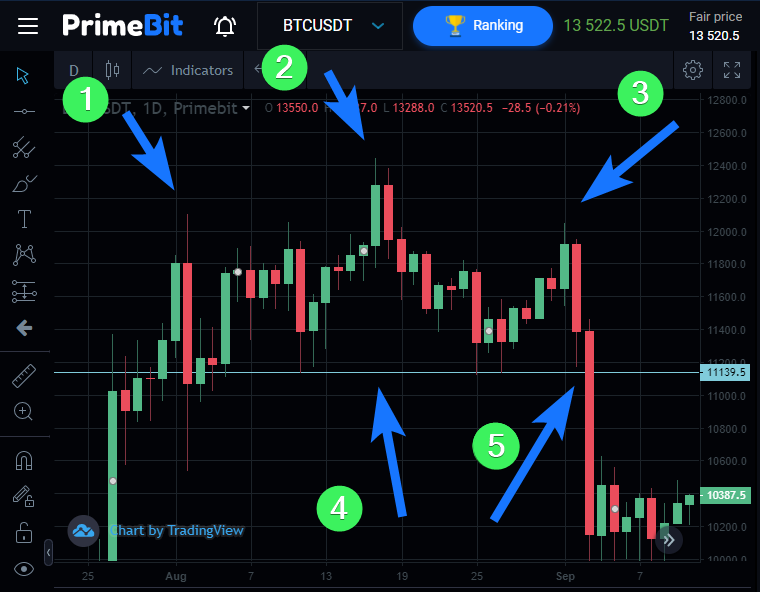
The price breakthrough resistance level (5) confirmed the price pattern and caused further price decline to the $10,000 support level.
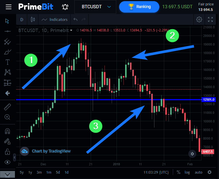
Double top
This pattern also indicates a reversal from a bullish to a bearish trend. On the chart below, the BTCUSDT price was trending up until it reached the first top (1). Afterward, we could observe a retracement to the support level, a potential neckline (3). This was a good moment for opening a short position as the price went from $12,500 to $6,400 in the next days.
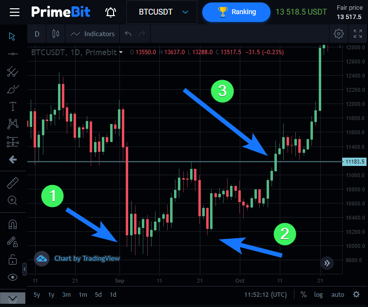
 Double bottom pattern
This formation is just the opposite of the one above. Once again let’s take a look at the 1-day BTCUSDT chart. During a downward trend, the price reaches the $10,000 support (1) and retraces up to $11180. The second bottom is slightly higher than the previous one. We then see a price breaking the neckline (3), confirming the double bottom pattern, and initiating a strong upward trend that took bitcoin yet again above $12,800. As we learned later it was the right moment to buy BTCUSDT.
Rounding bottom
When prices decline many traders look for the best moment to open buy positions. This is a common strategy among investors who believe in cryptocurrency in the long term perspective. In the LTCUSD example below, drawing a curved line on the 30-minutes price chart could have helped you to identify the right moment to enter into a long position. When using this pattern you aim at buying an asset at the bottom of the curved line you draw around the bodies and shadows of the candlesticks.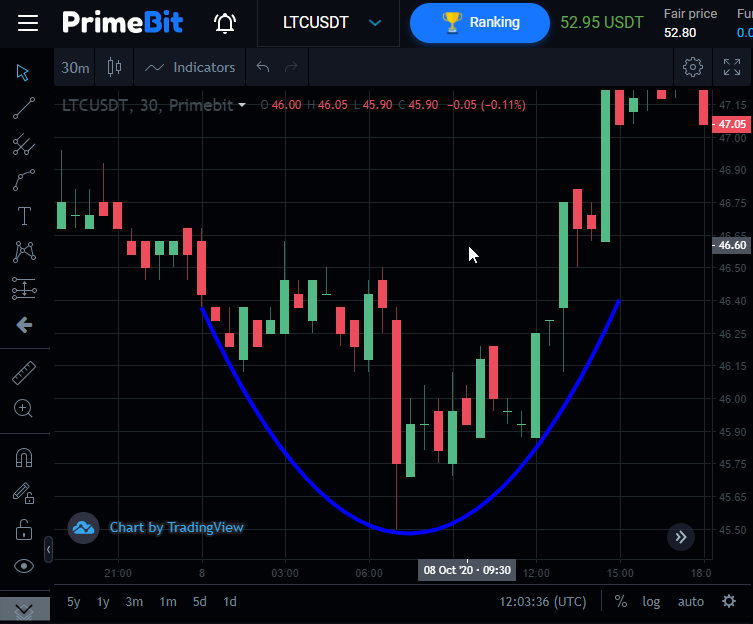
Cup and handle
This pattern is an extension of the previous one. Using just the rounding bottom signal can be risky as you may confuse a reversal sign with a retracement. That is why you can adapt a little more sophisticated approach and wait for a confirmation.
The “cup” (1) is a formation similar to the “rounding bottom”, however, traders wait for the confirmation in the form of “handle” (2).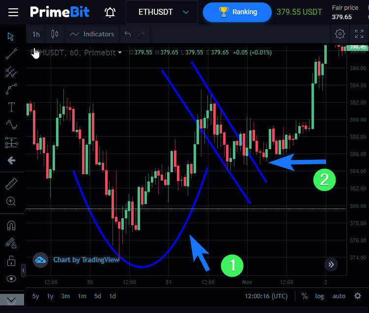
In the example above, the handle made on the 1-hour, ETHUSDT proved to be a retracement on the newly formed upward trend. Traders waiting for the confirmation bought the coin at a little bit higher price than the ones using the rounding bottom pattern, but they increased the chance of the trade being profitable. In this particular case, both groups made money on their long positions as the ethereum rose from $374 to $400 in just a few days.
Ascending triangle
Now let’s take a look at two price continuation patterns. One of the most common is the ascending triangle. You can draw triangles connecting the candles’ top and bottom shadows. In an ascending triangle, the line marking support has a higher slope than the line indicating resistance.
In the example below, you can see the triangle that predicts the long-term trend on the BTCUSDT 1-week chart. This formation suggests that in a broad timeframe the price should continue its growth. You can’t see the continuation, because the chart is very recent. We’ll see by the end of the year if this ascending triangle pattern will work.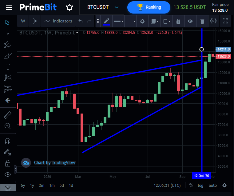
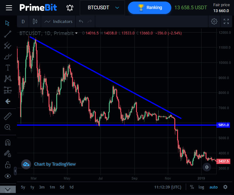
Descending triangle
Below you can see an example of just the opposite. This is a 1-day BTCUSDT chart from the second half of 2018. The technical analysis suggests a likely continuation of the bearish market here.
As the descending triangle pattern suggested, the price broke the $6,000, $5,000 and $4,000 support levels going down to $3,200 in December.
Symmetrical triangle
This is an example of a bilateral pattern. It’s neither bullish nor bearish and may predict higher volatility. In the example below of the 1-day BTCUSDT chart in summer 2020 you can see that the cryptocurrency market was at the crossroads. If you spot a triangle with symmetrical arms, it is advisable to look for some other signals before placing any orders. In the example below the market continued to grow, and started the bull market on cryptocurrencies that lasts until today.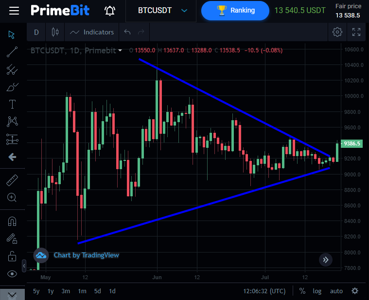
Just like other technical analysis tools, chart patterns are not 100% accurate. Practice using them and choose the ones that best fit the cryptocurrency you trade. Consider accommodating other factors such as market sentiment (bullish or bearish) and the time frames. Some patterns may work better for the bull market on bitcoin, other bearish trends on ethereum, some for 1-day charts, and other 5-minute charts.
The theory is pretty simple, but identifying and trading price patterns may be tricky. Good judgment comes from experience. Go to PrimeBit and practice spotting chart patterns with a Contest Account. Although you don’t risk your own personal funds, just like with any other Demo account, in our Contest you can win real prizes. The total prize pool is $5,000. At the moment, it’s just enough to make one trade that yields 108% profit to get 1 of 10 weekly prizes.
If you start recognizing chart patterns properly, you have a great chance of a quick advance in Global and Weekly rankings. This trading competition is not only a free trading course but also a highway to your instant profits. Give it a try!
")